Are you a visual learner, someone who learns best by seeing concepts or ideas? If so, you probably like using pictures, graphs and charts to learn new things. But what about auditory and kinesthetic learners, those who learn better by hearing, doing, and touching? Physical science relies heavily on conceptual images to illustrate concepts like velocity, forces, density, and electric current. Reading a graph can be challenging for some students so it’s important to develop assignments that teach students how to accurately read and interpret visual information.
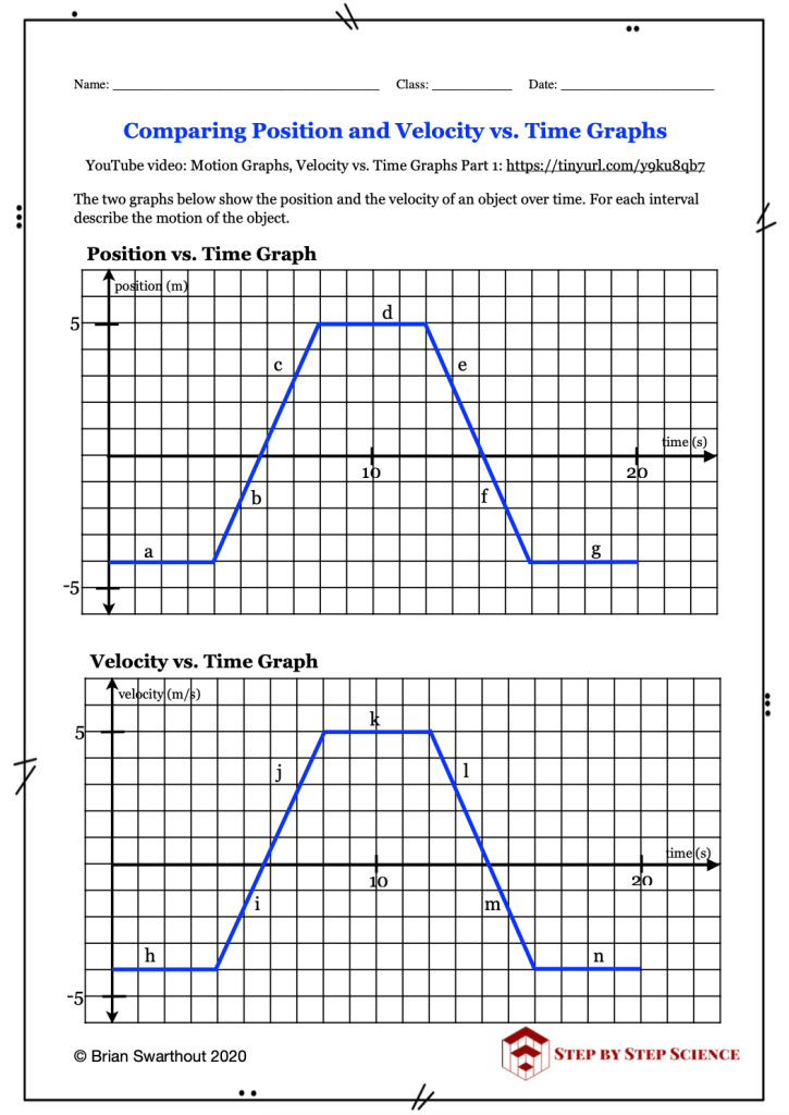
One of my favorite assignments is to have students compare and interpret the information presented in position and velocity vs. time graphs. In class we spend a significant amount of time first discussing the meaning of the position vs. time graph and then the velocity vs. time graph. Next, I present the assignment and ask my students to describe the motion of the object during each of the time intervals a through n. They should be able to say whether the object is at rest, moving with a constant velocity or accelerating.
Is the object at rest, moving with a constant velocity or accelerating?
If the object is moving with a constant velocity, what is the direction of motion?
If it is accelerating, is it speeding up or slowing down and in which direction?
When given the two different graphs with the same shape, students give me a lot of confused looks and are hesitant about how to begin. Often, they incorrectly jump to the conclusion that because the graphs look the same they mean the same thing. Because students tend to state the first thing that comes to mind, they need to be reminded that it is important to first take a few minutes to think about what information is presented on each graph. In this case, both graphs have time on the x-axis but different information is presented on the y-axes. How does that affect the description of the object’s motion?
Ask your students, “How does the meaning of a horizontal line on the position vs time graph differ from a horizontal line on the velocity vs time graph?” Let them think about it for a few seconds and suddenly a few eyes will brighten as they begin to realize the difference. Now they can move on to the sections of the graph that have positive and negative slopes. Remind them that just because the graphs are on the same page and look the same, they do not present the same information. In fact, the information is quite different and each one needs to be analyzed separately.
This assignment is part of my Kinematics: Velocity vs Time Graphs product in my TpT store. With so much data and visual information to absorb nowadays, graphs and data tables are becoming more and more ubiquitous. This increases the importance of teaching students how to accurately read and understand the data presented to them.

